Ruston unveils new logo design (story preview)
Ruston High School's new "R" logo features a slightly different typeface to distinguish from Rutgers University's.
Update: full story here
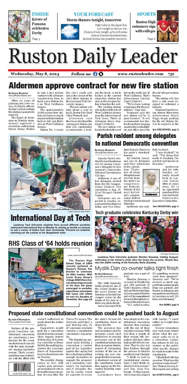
All it took was a simple slice of a serif here and a serif there, and it’s done.
The new Ruston High School logo has been unveiled, six months after Learfield Sports, a Texas-based marketing company that manages the Rutgers University brand, asked RHS to stop using the current logo.
The new RHS logo looks similar to the old with the exception of what were four serifs on the bottom part of the “R” being cut to one. In typography, a serif is a small line or stroke regularly attached to the end of a larger stroke in a letter or symbol within a particular font or family of fonts.
Supervisor of Secondary Education Ricky Durrett said the new logo will not be used during the upcoming Ruston High School football season because it was only approved last week. He said the new logo will be phased in as the RHS athletics programs order new items.